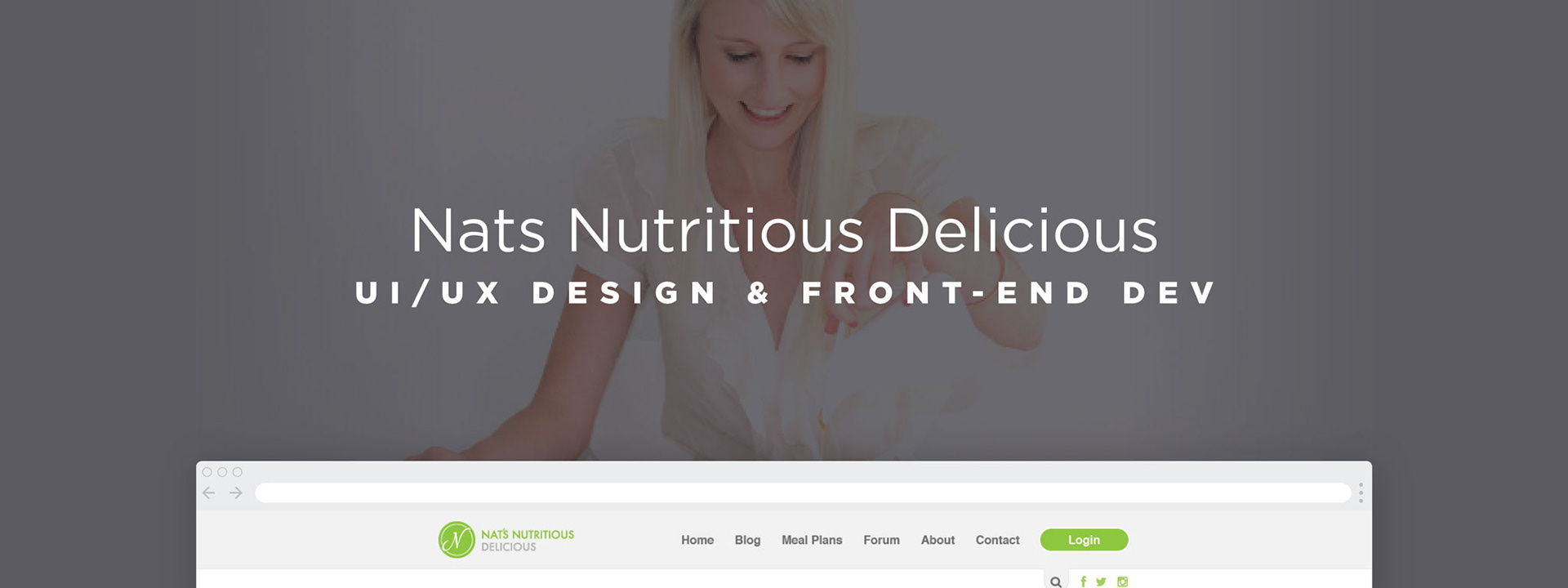
I was lead UI/UX designer for a challenging meal planning web app.
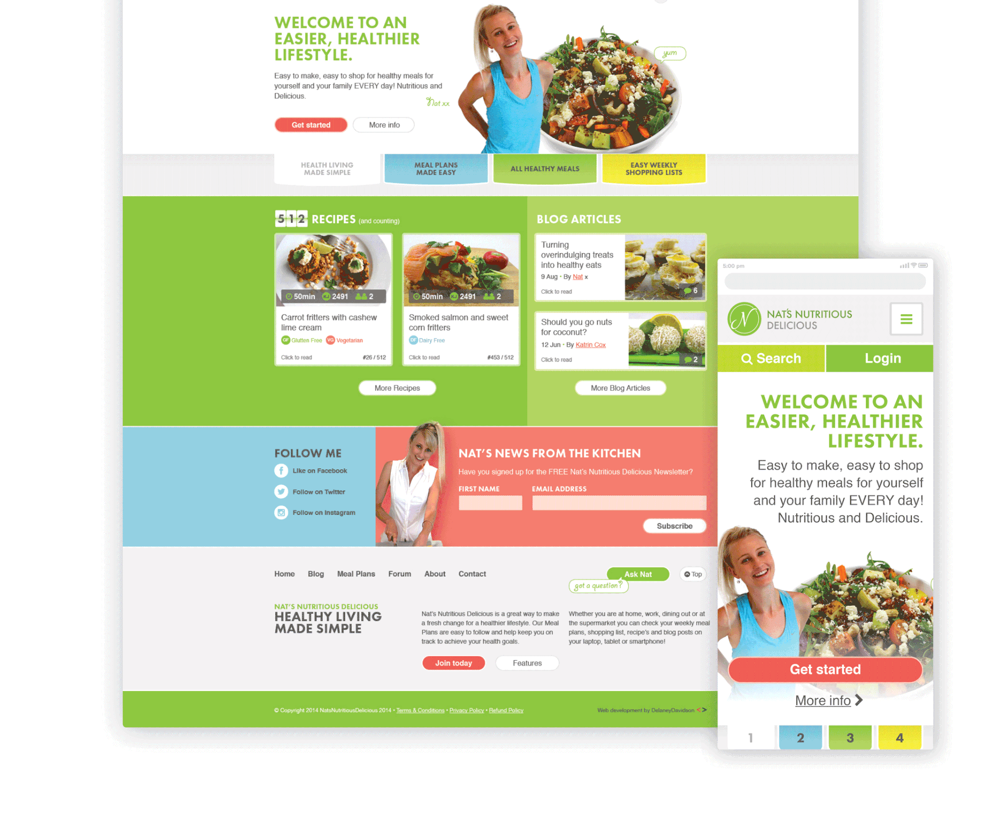
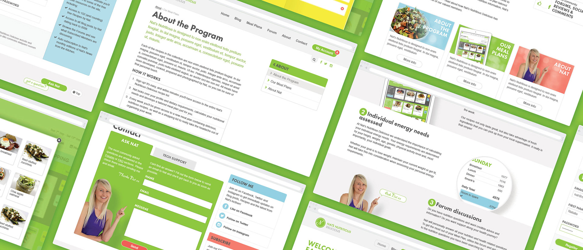
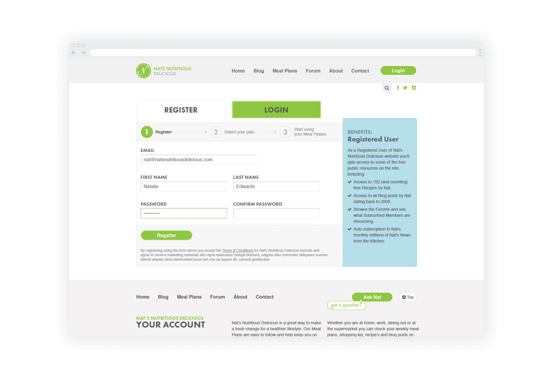
Nutritionist Natalie Edwards had developed a successful health food blog with a following in the tens of thousands. Leveraging this readership volume her goal was to build a business monetised by a member based meal planner system - the differentiating factor being personal weekly meal plans and nutritional advice provided by Nat herself. Nat had already commissioned an agency to complete the site which unfortunately completely missed the mark, the result being a reduction in visitation through a combination of usability and DNS issues. Nat approached us initially to cease further user drop-off, implement new features and designer a more appropriate visual concept and user friendly interface. Redesigned and new features included: Advanced members area with ecommerce, meal planning with integrated recipes (also stand alone depending on permission levels), nutritional tracking, water intake tracking, goals and automatic shopping list generation, blog and advanced user reporting.
Process
By necessity our process was a bit unorthodox with the re-development of Nat’s site. Nat had already completed in-depth user analysis in partnership with the incumbent developers providing us with a head start and allowing us to direct more of the limited budget to design and development. We were able to use this information combined with an internal analytics review to audit the UX/UI strengths and weaknesses of her existing site. Being the point of contact for the project I was key in evaluating these findings with Nat to clearly identify how we would improve the design and functionality.
The most immediate concern was to curb the user drop-off following the incumbent redesign. Guided by the findings from user analysis and site audit I designed a series of user interface (UI) concepts that were more appropriate for the target market. Once a preference with identified I redesigned the UI for the existing functionality.
The long term goal however was to develop a more elegant user experience (UX) and implement advance new functionality that would make membership more valuable and enhance content consumption. With this in mind - once the improved UI had been launched - we turned our attention to delivering this.
Stripping back all functionality (existing and new) we began outlining an improved UX from the ground up. I played a key role in re-scoping the functionality, documenting this and outlining the user flows and information architecture. I then incorporated the improved UX into a comprehensive set of wireframes which were developed into a prototype for Nat and beta users testing. These went through some iterations before I applied the new UI concept and designed a comprehensive, high-fidelity UI.
As each stage moved into the development phase I played a key role in front-end development. Particularly in ensuring UI consistency and finesse.
UI/UX challenge in detail
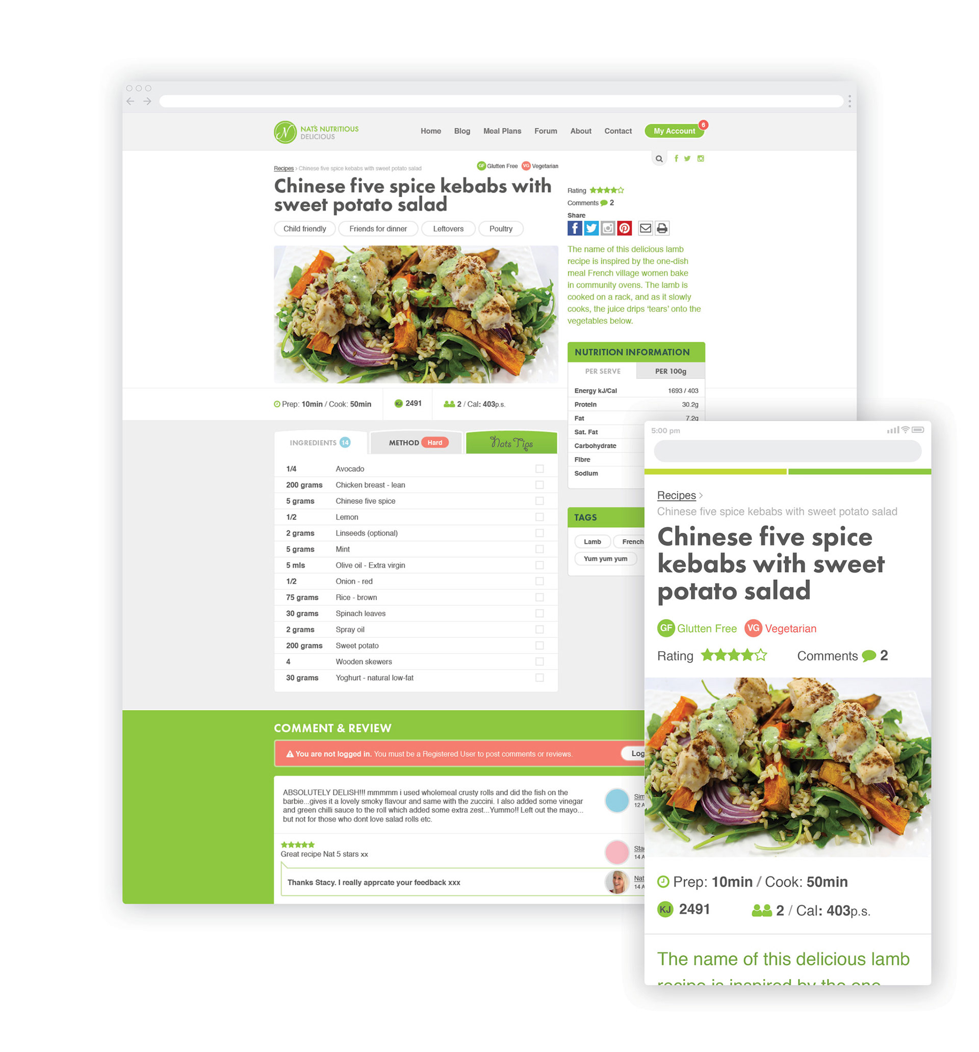
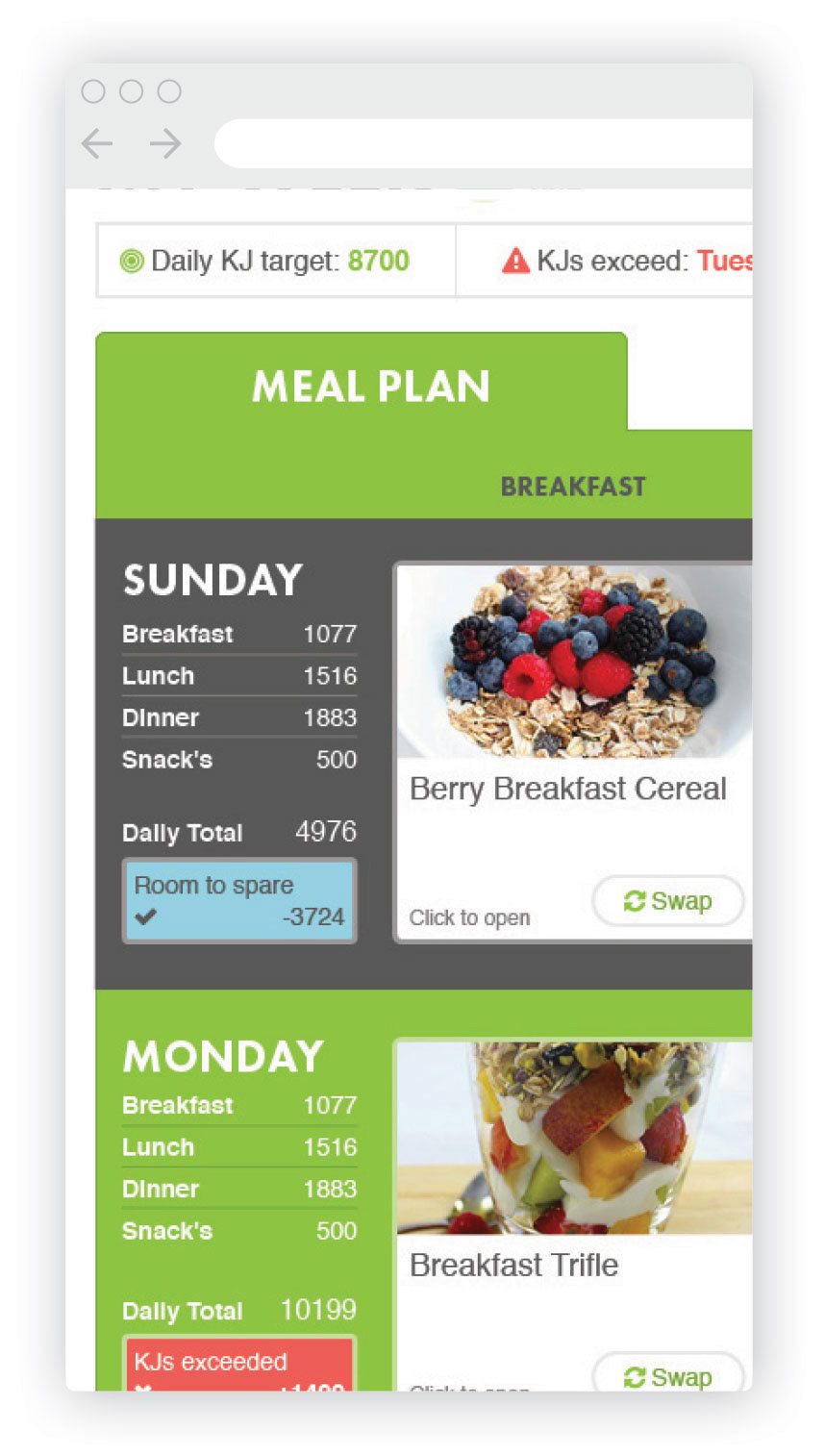
Undoubtedly the most challenging UI problem in this project was designing an intuitive interface for the powerful meal planning system. In particular how to structure recipes and how they interacted in meal plans, especially on mobile where the majority of members were operating. My solution included a keyword based recipe filter function that radically improved how users planned their weekly meals and an intuitive drag-and-drop function allowing them to easily edit their plans. Both features informed, in real time, nutritional information allowing users to see immediately how individual meals affected their nutritional goals for the day/week. The individual recipe objects themselves proved challenging to layout due to varying levels of content and information presentation based on permission levels. Whilst a fully financial member would be presented with comprehensive content, to attract new members it was important to allow public users a preview of the recipe.
Summary
Overall the redevelopment and new UI design was very well received by the user base. The initial redesign - converting the incumbent site functionality - was successful in curbing user drop-off mitigating further loss of value to Nat’s business. My UX design for the powerful meal planner functionality proved effective in increasing the perceived value of membership driving new registrations over 200%. The result allowed Nat to grow her business further eventually launching a chain of pre-made meal stores.